Infographics are one of the most powerful and effective ways to market businesses and products and they are the third most-used type of content strategy pursued by marketers globally.
If done correctly, infographics can communicate messages quickly and simply while creating enormous visual page-stopping power for audiences. They can become highly shareable, helping to boost awareness and generate valuable links for marketers across the web.
Infographics that combine useful data and visual impact can also become instrumental in building trust among a business’s users and establishing their brand authority in their space.
Here are 8 recent infographic trends to help startups create a compelling marketing piece and grow their business:
Table of Contents
Trend #1: Timelines
Timelines are having a resurgence since Covid-19 started in 2020. The world has transformed and many people are using timelines to help portray the changes to their business model or within their industry to communicate a bigger idea since the pandemic started.
There are many ways to showcase data along with the specific timeline. Below is an example of a timeline of the events around the beginning of Covid-19. The muted colors combined with pops of bright color to highlight specific data points helps tell the story.
The product life-cycle of Nintendo’s products is also very compelling with a fascinating chart design combining useful info and thorough product descriptions. Something every business should consider, especially those with many different product skews.
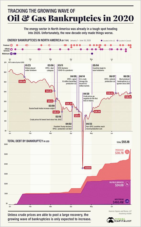
Source: Visual Capitalist
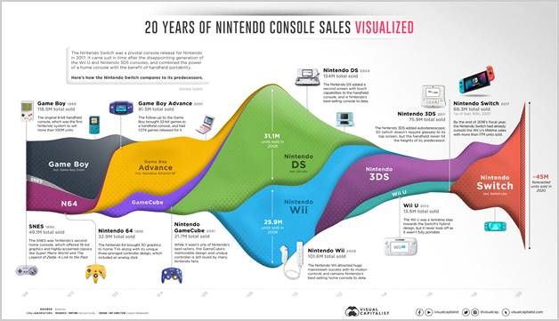
Source: Visual Capitalist
Trend #2: Maps
The growing impact of inflation around the world and the war in Ukraine has now made many people hyper-aware of their geographic surroundings. It’s also created a dramatic amount of new interest from consumers as the prices of many products such as food, wages and real estate are all changing dramatically from state-to-state and in other regions of the world.
Maps can be an incredible way to communicate these themes by combining a geographic area familiar to the reader with new information layered on top. Since the reader may already be familiar with the map, there is an immediate baseline for them to dive in deeper and absorb the new data provided.
The gas prices map below is a excellent example of a hyper-relevant topic overlaid with easy-to-digest data, thus making is a strong infographic.

Source: Visual Capitalist
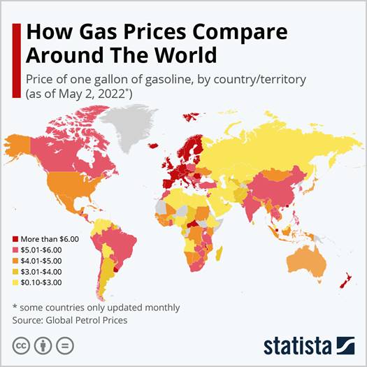
Source: Statista
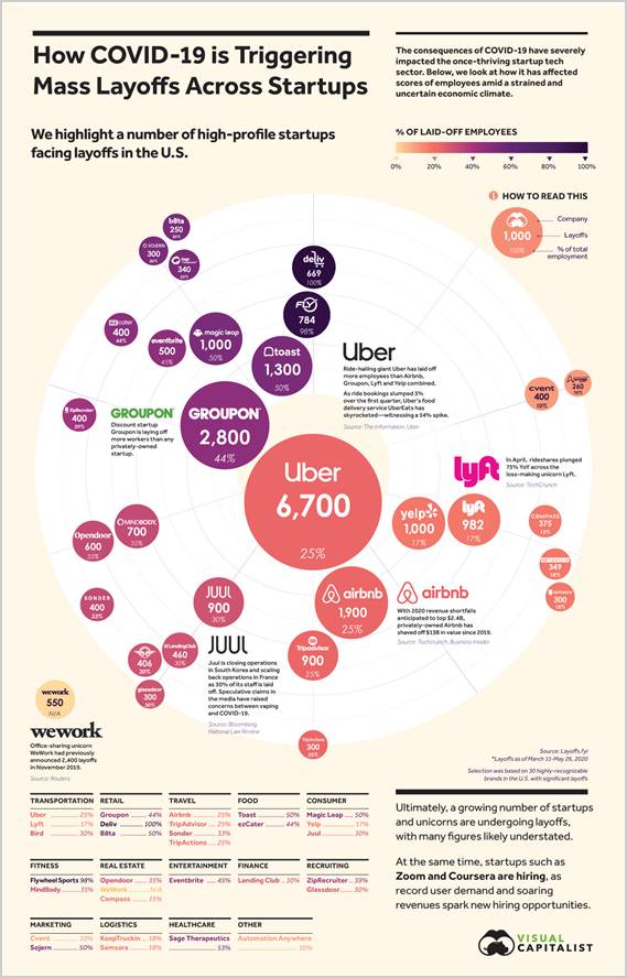
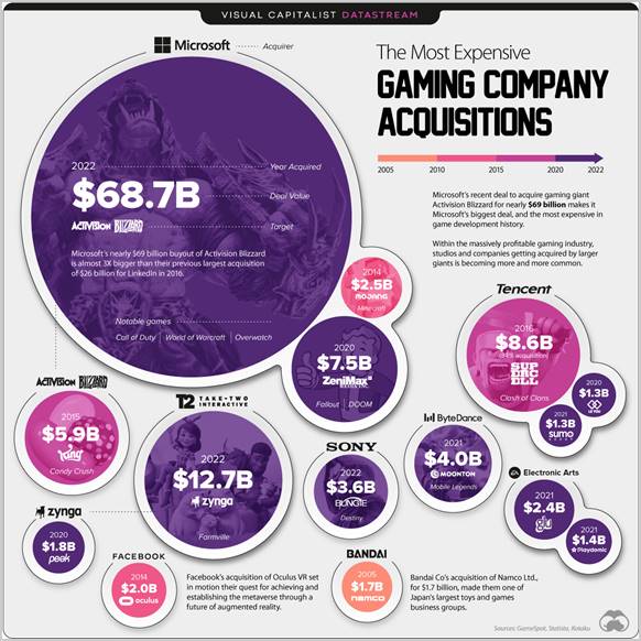
Trend #3: Bubble Charts
Bubble graphs have become trendy recently as a way of comparing sizes of similar items.
The first infographic below is powerful. It shows the scale of layoffs by some of the biggest companies in the world during the Covid-19 crisis. The designer could have made a simple, table, but a bubble chart can often more easily show the comparisons of the layoffs.
In the case of the “Gaming Acquisitions” infographic, the bubbles are oversized which enables the designer to add key information inside the bubble, where previously they would need to make more room outside of it, or trim the amount of content.
Overall, bubble charts are less common and can provide a more compelling reason for readers to dive in and share it.
Source: Visual Capitalist
Source: Visual Capitalist
Trend #4: Interactive
A recent report showed that 88 percent of marketers said interactive content differentiated them from their competitors and 93 percent said it was effective when it came to educating consumers.
A good example is this infographic of how a human is created. It’s powerful as a static graphic, but it’s even more engaging because it’s moving in a hypnotic way that pulls the reader right in.
This type of animation can stimulate better memory retention as people recall 65 percent of the information they view in a graphic on average (and they recall just 10% of the information they hear spoken out loud).
Despite the extra work involved in producing great interactive content, it’s a big trend that could result in a bigger ROI in the end.
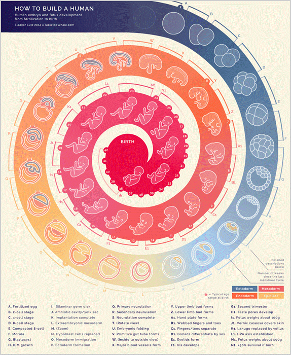
Source: Tabletop Whale
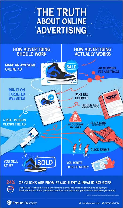
Trend #5: Bright Colors
Bright colors can provide incredible stopping power. Different colors can also project different emotions. Blue often represents trust, red is for bold and excitement and green expresses growth and peace.
Infographics with saturated, or more muted colors are also trending when you combine them with vibrant pops of colors to help direct the user’s eye to key data points that help tell the story.
The below infographic from Fraud Blocker commands attention with strong use of color throughout, especially when it’s next to another content piece that’s less colorful.
Source: Fraud Blocker
Trend #6: Real Pictures
When people hear infographics, they mostly think of something with artistic illustrations and animation. However, mixing art with real-life images can boost relevance, relatability, and engagement.
This hot dog graphic is a few years old, but it still stands the test of time. It’s one of the most popular food infographics rated on the graphics site visual.ly and an excellent example of this trend.
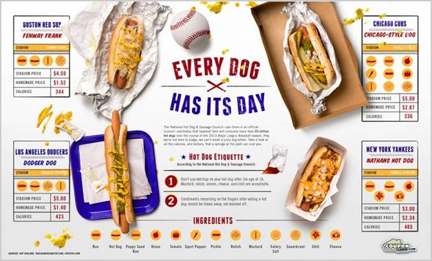
Source: Coupon Cabin
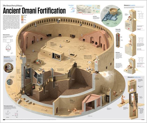
Trend #7: 3-Dimensional
3D images are becoming more popular as 3D software becomes more accessible. This style is great for products or images that have a lot of complexity – such as with outdoor images, engineering products or architectural designs.
Both of the images below show buildings rendered in 3-dimensions. They help give the reader a clearer explanation of the features of the buildings and where specific items are located.

Source: prdctdsgnr.com
Source: Antonio Farach
Trend #8: Heatmaps
Heatmaps round out the list of what’s trending in infographics today.
As users have less time to digest numbers and data, a heatmap can very quickly show where the hot and cold data points are.
In this infographic from Inc magazine, the darker and lighter colors enable readers to quickly skim and understand which are the most affordable cities to consider for their startup.
Heatmaps can be used to display a wide range of information from maps and charts or to show correlations between temperatures and popularity.
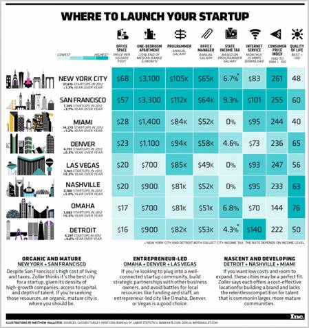
Source: Inc.com
By creating meaningful content that adheres to these trends, marketers can boost their engagement and sales while educating and building trust among their customers.