There are so many data visualization tools available on the market today. There are at least dozens, if not hundreds, of different options, all with their own array of bells and whistles. Choosing the right one for your purposes can be daunting.
When sorting through your options and deciding which, if any, data tool or tools will best serve your organization, you have to think deeply about what your company needs from the tool. Here are the five questions you need to ask to narrow things down.
Table of Contents
1) Do I Need to Unify Multiple Datasets?
Often companies look for data visualization tools that can pull together data from multiple sources and present it on the same dashboard. Most tools can do that, and some tools can go a step further and allow you to filter multiple data sets with the same filter.
2) What Sharing Capabilities Do I Need?
Who will be generating reports based on your data? If it’s just a few data analysts, that requires a tool with a very different interface than if you want all stakeholders or a wider pool of employees to be able to generate reports. Data analysts may be more comfortable with complex interfaces and will get more functionality out of them, but a wider pool of users is going to need something more simplified. Choose a data visualization tool based at least partially on what the users will need and want from the interface.
You should also consider whether reports will need to be automatically updated and, if so, whether they can connect to a live database to pull the updated information they need on the schedule they need it — whether that’s hourly or monthly, or somewhere in between. Consider also whether users need to export data out of reports, or share reports through a portal or via link.
3) How Large and How Raw Are the Datasets?
The larger your datasets, the harder they’re going to be to deal with. Data scientists (and scientists in general) know that large data sets need to be handled right in order to extract accurate meaning from them. Really big datasets are too big for human beings to grapple with, which is why data science and machine learning are evolving as they are.
But not every data visualization tool can come to grips with large datasets, either. Some tools simply don’t have the performance capabilities to deal with large datasets effectively. Make sure you’re choosing a tool that can cope with the size of your datasets. You should also consider how much aggregation the dataset will require before it can be fed into the visualization tool.
4) What Filtering and Interactivity Features Do I Need?
Interactivity features are important to help users engage with the data and hone in on the data that is most useful to them. Tooltips are a particularly useful tool that can offer additional insight into data points in a pop-up that appears as the user hovers the mouse cursor over them. Most tools have some degree of filtering interactivity on the dashboard, which can allow users to reorganize data based on different metrics, like daily or regional sales trends, for example. These interactivity features will do a lot of the heavy lifting in terms of helping your users understand what data means.
5) Will I Need to Create Custom Visualizations?
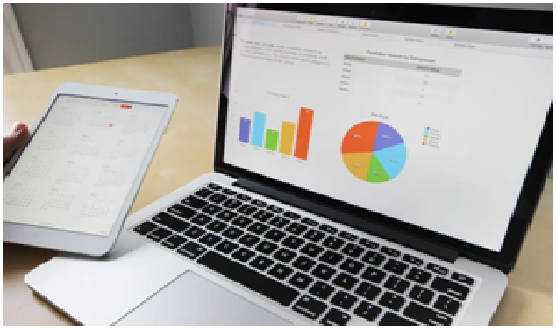
Almost all tools offer users the ability to create a standard range of pretty standard visualizations — that’s pretty much their primary purpose. Bar charts, pie charts, tables, line graphs, and even slightly more exciting things like scatter plots are pretty par for the course. However, many organizations need to create custom visualizations. Some tools come with robust community support for improvising out-of-the-box solutions. Others allow users to upload custom chart types.
Choosing a data visualization tool can be a complex process, as you consider who will be using it, how they’ll be using it, what kinds of datasets you’ll be parsing and how much you need to customize the final results. Take your time when choosing a tool, and look for something that suits your business needs and processes, rather than trying to change your needs and processes to suit the software. With the right tools, you’ll be pleasantly surprised at what your data can do.