In 2016, the Australian Government ordered the use of the world’s ugliest colour in cigar packaging in order to discourage smoking.
This is just one of the millions of business and political strategies which utilise the colour theory. Colour helps us understand our environment and it greatly affects our thoughts and the choices we make.
That is the reason why businesses greatly consider the use of colour in their offices. In this era when we give so much effort in office design, colour is not just a decorative element but a strategy to improve the workplace. Companies use it to connect people with different values in their organisation. The colours will help these individuals understand who they work for and why they do it. At the same time, these colours can keep the employees happy, productive, and healthy. If they feel highly satisfied, it’s good for the business.
So, how do you incorporate colours in your office design?
Businesses don’t just choose their colours for their office design — they use colour psychology. They want the colours they use to appeal to people’s emotions and influence the perceptions towards work.
Right now, our understanding of how colours affect our cognition is deeper compared to before. For example, the colour yellow doesn’t always promote optimism, warmth and creativity. We recognise more than a hundred kinds of yellow and each shade and hue has a different effect on our minds.
At the same time, other design elements such as lustre, translucency, lighting, and pattern also affect the how we see colour. All of these contribute to a person’s overall perception of the work environment.
This is why collaboration between architects, interior designers, and the company is important. Paint isn’t enough to help you achieve your company’s desired goals. As architects, our job is to balance all the elements in the office to create a comfortable and enjoyable place where people work efficiently together.
Designers follow several rules when using and combining different colours in a space, as well as multiple strategies to tailor the colour’s purpose in the design. Here’s how:
Avoid the predictable
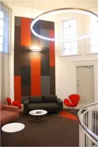
Designers follow a colour palette when they create your office space. It contains all the colours that you’re going to see on your floor, wall, and on pieces of furniture or decor in your office.
According to our Brisbane architects, using a single spectrum of colour will give your office a harmonious yet predictable look. People will find it bland and uninteresting one day. In choosing a family of colours, it is more effective to eliminate one to two colours and replace them with neutrals.

If you want, you can pair your main colour with another that complements it well. Use the color wheel as your guide to different colour combinations. The opposing colours are complementary to each other. Then, refer back to the colour sheets of your designer to get the desired hue or shade.
Finally, give it character. Use pattern and texture (the right ones) to add interest to the space.
Give it a purpose
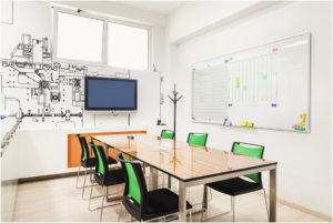
Colours are also essential to create an accessible workspace. For example, all your signages and tools for wayfinding must have a higher contrast from the rest so each one stands out from its background. Do this to accommodate your employees and visitors who have sensory disorders particularly those who have impaired vision. Good thing this is mandatory in all commercial spaces. It helps make the built environment inclusive for all.

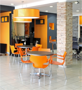
Use it to highlight the things that matter.
The workplace is a diverse community. You have different people who uphold different values coming together to help you achieve the company’s goal.
Colours have the ability to connect these people. A person can associate a colour with an idea or a goal. Combine it with experiential graphic design or graphics in your office interior and this should reflect your brand and uphold your company’s culture.
This is the reason why we encourage using the colours of your brand in your office design. Think about it. If the workspace reflects the essence of the institution, your employees might find something unique and engaging about their jobs which inspires them to do better. It can also serve as a reminder that all the effort they give to the company is appreciated.
Also, making your office your brand ambassador helps people who visit your office see your company as an authority in the business that you do.
Harness the power of colours in the workplace
For the longest time, we used colours in marketing and branding. Companies and organisations can spend a huge amount of money in properly designed advertisements to attract more customers and increase their income.
It’s the same logic when it comes to using colours in your office design. Colours can help businesses flourish through connecting the employees to the brand and improving their work experience. But before you can achieve it, you have to ensure that the colours you use pairs well with other design elements in the office such as lighting, building materials, textiles, and patterns. These are technical stuff about office design that you will need help with. It costs to get help from a design professional, but it’s worth it once you see the positively affect of colour in the workplace and its everyday users.
Charlene Ara Gonzales is a design writer in Superdraft Australia. She features the most useful and stunning home design and office interiors they create on Facebook, LinkedIn, and Instagram.