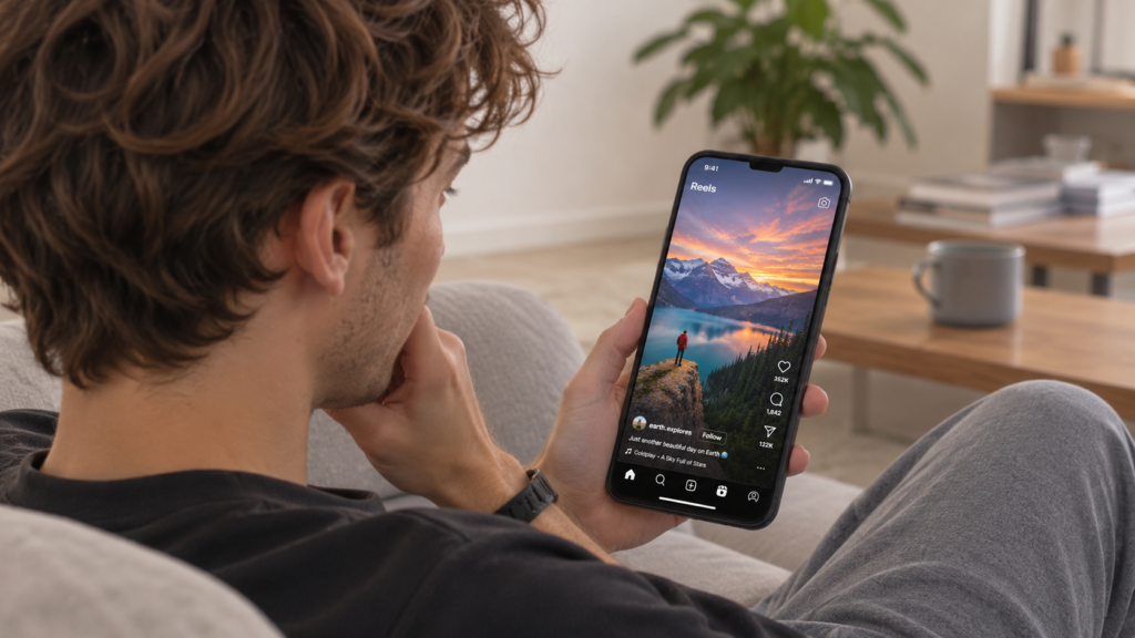
Getting people to click on your videos is not always easy, even when you have spent hours researching, filming, and editing the content. With so many videos competing for attention, viewers often decide what to watch in just a few seconds. Before they hear your introduction or see what your video offers, they usually notice one thing first: the thumbnail.
A good thumbnail can make a significant difference in how many people click on your video. It gives viewers a quick idea of what to expect, creates curiosity, and helps your content stand out among similar options. While thumbnails alone cannot guarantee more views, improving their design is a practical way to increase your click-through rate (CTR) and attract the right audience.
Table of Contents
1. Understand Why Thumbnails Matter for Video CTR
A thumbnail plays an important role in this process because it is often the first visual impression viewers get. When someone scrolls through YouTube or browses video recommendations, they rarely have time to examine every option. Instead, they quickly scan images and titles to find something that catches their interest.
An effective thumbnail helps communicate the value of your content almost instantly. It might highlight an interesting result, show an expressive reaction, or introduce a question that viewers want answered.
However, the goal should not be to attract clicks at any cost. If your thumbnail promises something your video does not deliver, viewers may leave early. The best approach is to create a thumbnail that is interesting while still accurately representing the content.
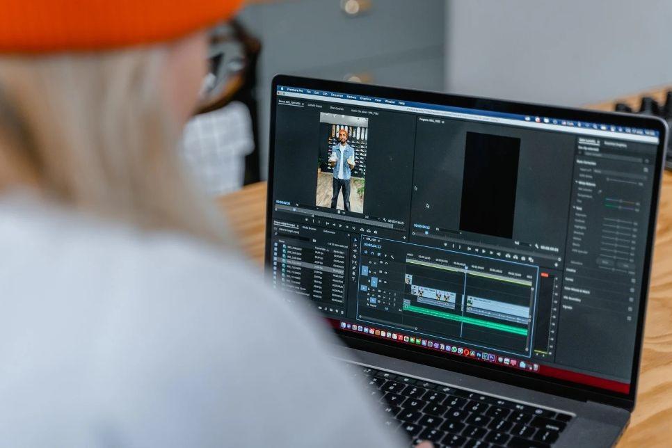
2. Keep Your Thumbnail Simple and Easy to Understand
One common mistake creators make is trying to fit too much information into a single thumbnail. They add multiple images, long text, decorative elements, and different colors, hoping to make the design more noticeable.
Unfortunately, this can have the opposite effect. When viewers see a crowded thumbnail, they may struggle to understand what it is trying to communicate.
A simpler design usually works better because it gives attention to the most important visual elements.
Instead of repeating the entire video title, use a short phrase that adds something extra. For example, a video titled “How I Organized My Small Apartment” could use thumbnail text such as “More Space, Less Clutter.”
The title and thumbnail should work together rather than deliver exactly the same message.
3. Use AI Tools to Create Better Thumbnails
Creating an attractive thumbnail does not always require advanced graphic design skills. Today, several online tools make it easier for creators to produce professional-looking visuals, even if they have limited design experience.
AI-powered thumbnail tools can be particularly useful when you need to generate ideas, experiment with different layouts, or create several versions of a design.
For example, CapCut AI thumbnail generator can be one option to explore when creating thumbnails for your videos. AI-assisted tools can help simplify parts of the design process, making it easier to experiment with visual concepts and develop a thumbnail that suits your content.
Other useful tools include Canva, Adobe Express, and Photoshop. Each offers different features depending on how much control you want over the final design.
4. Choose Images That Create Curiosity
A thumbnail should give viewers a reason to stop scrolling. One effective way to do this is by choosing an image that makes them curious about what happens in the video.
Rather than simply selecting a random frame, look for moments that communicate emotion, transformation, or an interesting result.
For example, a fitness creator could show a before-and-after comparison, while a travel creator might choose an unusual destination or a breathtaking landscape.
5. Use Colors and Contrast
Color is another important part of thumbnail design. When several videos appear next to each other, a thumbnail with clear contrast can be easier to notice.
You do not necessarily need bright or unusual colors. What matters more is choosing combinations that make the main subject visible and separate different elements clearly.
For example, placing white text over a light background can make the words difficult to read. Adding a darker background, shadow, or outline can improve visibility.
A few practical tips include:
- Use contrasting colors: Make sure text and important objects stand out from the background.
- Limit your color palette: Two or three main colors can help create a cleaner design.
- Highlight key details: Use a brighter color to draw attention to the most important element.
- Check the overall balance: Avoid having too many competing colors or visual effects.
It is also worth considering consistency. If you regularly publish videos on the same channel, using a recognizable color palette can help viewers identify your content more easily.
6. Make Sure Your Thumbnail Works on Mobile Devices
A thumbnail might look impressive on a computer screen but become difficult to understand when viewed on a smartphone.
This matters because many people browse video platforms on mobile devices, often while scrolling quickly through recommendations.
Small text, thin details, and crowded layouts can easily disappear on smaller screens.
Before publishing, reduce your thumbnail to approximately the size it will appear in a video feed. Check whether the main subject is still recognizable and whether the text remains readable.
If something becomes difficult to recognize, simplify the design. A thumbnail should communicate its main idea even when viewers only glance at it briefly.
7. Match Your Thumbnail with Your Video Title
Your thumbnail and title are two parts of the same message. They should complement each other and give viewers a clear reason to watch.
For example, imagine a video titled “5 Mistakes That Are Ruining Your Indoor Plants.” The thumbnail could show a struggling plant with a short phrase such as “Stop Doing This!”
The title explains the topic, while the image creates an emotional connection and encourages curiosity.
Avoid using a thumbnail that suggests something completely different from the actual video. Although misleading designs might generate initial clicks, they can disappoint viewers and damage trust in your channel.
8. Test Different Thumbnail Designs
Even if you follow all the design principles above, you cannot always predict which thumbnail will perform best. Sometimes a simple design outperforms a more elaborate one, while an unexpected image might attract more attention than your original choice.
That is why testing is useful.
If your video platform supports thumbnail testing, experiment with different versions to see which one attracts more clicks.
Try creating two or three versions with different approaches. For example:
- Version A: A close-up image with minimal text.
- Version B: A wider image with a more descriptive phrase.
- Version C: A contrasting background with a different focal point.
When possible, compare designs that differ in one major element. This makes it easier to understand what might be influencing viewer behavior.
9. Avoid Common Thumbnail Design Mistakes
Sometimes, improving your CTR is less about adding new elements and more about removing things that make your thumbnail less effective.
Here are a few mistakes worth avoiding:
- Using blurry images: Low-quality visuals can make your content look less professional.
- Adding too many fonts: Stick to one or two readable fonts for a more consistent appearance.
- Using misleading images: Make sure your thumbnail accurately reflects what viewers will find in the video.
- Ignoring visual hierarchy: The most important element should be the easiest to notice.
- Copying other creators too closely: Take inspiration from successful channels, but develop a recognizable style of your own.
- Forgetting about consistency: A completely different design style for every upload can make your channel feel less cohesive.
You do not need to follow every design trend. Focus on creating thumbnails that are clear, relevant, and appropriate for your audience.
Final Thoughts
A great thumbnail does more than make a video look appealing. It gives viewers a reason to pause, sparks curiosity, and sets expectations for what they are about to watch.
However, getting clicks is only part of the bigger picture. The real goal is to create a connection between what viewers see and what they experience after clicking.
When a thumbnail genuinely reflects the content, it helps build trust and gives people a reason to return to your channel.
After all, a successful video isn’t just one that gets noticed but one that leaves viewers glad they clicked.